

Let me start off by saying that “The Hunger Games” was a great movie. I loved it. It was very well done, and created by very talented people.
The goal of a cinematographer is to bring the audience INTO the story and make the viewers feel so connected, that they cry or laugh when something happens, feeling as though it’s happening to them at that very moment.
While watching “The Hunger Games” for the first time, I was completely absorbed in the story and the plot and for the most part, I LOVED the camera work, and kept finding myself complimenting certain aspects of the cinematography. There are just a couple things that I found that should be obvious no-no’s. Things that stood out to me as I watched, and did not keep me immersed in the story. Things that are basics in film class and should be taught first semester. Things that the director should do everything in his power to reshoot and fix.
I’ll explain 2 scenes with “errors” that I noticed in this film that should have been addressed.
1. The camera crossed the line of action, and broke the 180 degree rule.
The 180 degree rule is basically this: imagine a line going through your scene that the camera cannot pass. To abide by the 180 degree rule, the camera must stay on 1 side of the line and on one side of the action, keeping the character in relative position to the camera. Look at the picture below for an illustration.
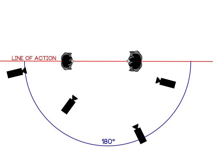
The subject on the left should remain on the left throughout the entire scene, even with different camera placements. This is to not create confusion in the scene. Even slight, subconscious confusion will take the viewer’s emotion out of the scene.
Now, of course, rules are made to be broken. In alot of action films, or scenes with alot going on, you’ll notice that the “line of action” gets crossed quite often. That’s ok, because there is alot going on and it’s ok in that scenario to show different perspectives like that.
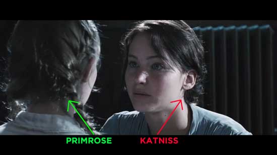
But, in “The Hunger Games,” that line was crossed during a very simple dialogue scene. Two characters, face-to-face, Primrose (the younger girl) on the left, and Katniss (the older girl) on the right. Then, on a close-up of their hands (at 20 seconds), they were all of a sudden flip-flopped, with Primrose on the right. WHAT!?
Watch the video below to see what I’m talking about. First, is the original, how it was shot. Second, edited to show how it SHOULD have been shot.
During the over-the-shoulder-shots, Primrose was always on the left. So, I could only assume that on the close-up of their hands, she would still be on the left. When I watched this for the first time, I was honestly puzzled for a few seconds. I wasn’t sure who’s hands I was looking at, and it is VERY important to understand what is happening in the scene at that time.
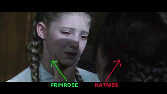
ORIGINAL ANGLE: Primrose on the left, Katniss on the right
ORIGINAL ANGLE: Primrose on the left, Katniss on the right
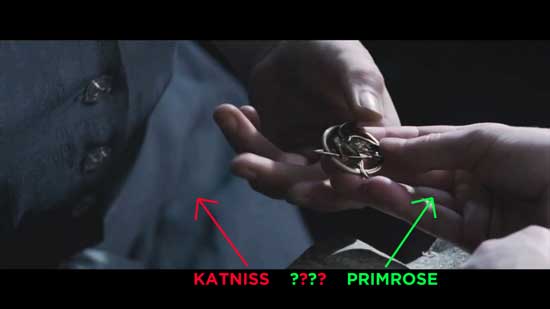
ORIGINAL ANGLE: Katniss on the left, Primrose on the right
In scenes like that, it is VERY important to maintain the 180 degree rule. As a director, make sure you are always thinking about where the camera should go, and how it affects the scene.
2. The camera cut from a “shaky” shot to a “steady” shot.
It was another simple dialogue scene where two characters were talking face-to-face. The angles were similar, over-the-shoulder shots going back and forth to each character. The problem was, that one character’s angle was handheld, and the other’s was completely steady, not making for a smooth cut between the two.
Watch the video below. First, is the original, how it was shot. Second, edited to show how it SHOULD have been shot.
It’s a subtle difference between the two cameras, but it’s enough to bug the viewer and take their attention from the emotion. It makes much more sense to just run both cameras handheld. There is no justifiable reason to switch it up in a scene like that. Most of the shots in this scene were handheld, I think that’s why the sudden “tripod” shot was so distracting. Sometimes, it’s not a problem going from a handheld, “shaky” shot to a locked-off, “steady” shot, but in this case, it was.
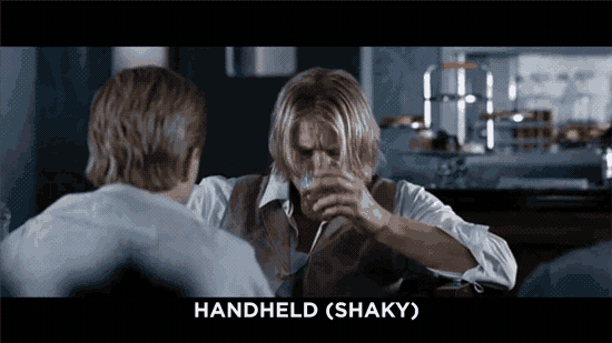
Everything has to serve a purpose to help tell the story. If the “steady” shot would have helped to convey an emotion, such as the character feeling calm and steady, or coming to a certain intelectual realization, that would have been ok. But, that was not the case. As the director or cinematographer, try to keep that in mind when shooting a scene with multiple, similar angles. Make sure your cameras don’t distract your audience from the story.
I’m not sure why they decided to shoot the two over-the-shoulder shots differently, but it could have been very easily avoided.